As the head of marketing and a member of the design team for Rosa Gres products, the interest I felt for the dress phenomenon was three-sided. 1) The speed at which it spread throughout the world, 2) what personal color perception implies for product design 3) and the coincidence with our latest investigations about color for improving our stoneware porcelain, which I will now expose.
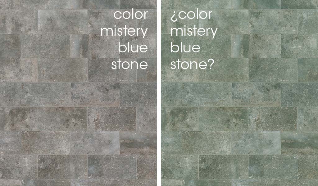
The dress immediately caught my attention (as happened to millions of people). It evidenced that we don’t visually perceive the world’s colors in an identical way. It depends on our brain’s interpretation of the light and the context it puts together. I will explain some cases I have experienced firsthand. For me, the color indubeige (our industrial paving) is completely beige (hence the name I gave it), whereas others see it completely gray. And it’s impossible to reach an agreement on this issue. More recently, a sample of a piece that I clearly perceived to be dark gray was perceived by someone else to be emerald green. It’s incredible. We are not crazy, our brains reach different conclusions regarding what we see, that’s the way it is. This article by Antonio Martínez Ron explains it very well, I recommend it.
One of the subjects we have been debating internally for a long time is the complexity we face when designing colors. We develop paving for exteriors (terraces and pools), which will therefore be seen by day under natural light. But the moment of choosing the color and deciding whether to buy it takes place in a shop with artificial light, which will almost certainly be different in every shop (white, blue, yellow, fluorescent.…). Thus the color inside and outside the shop can be very different. In general, in interiors the color tends to be greener (less attractive). And once placed on the terrace, the tone is very pleasant.
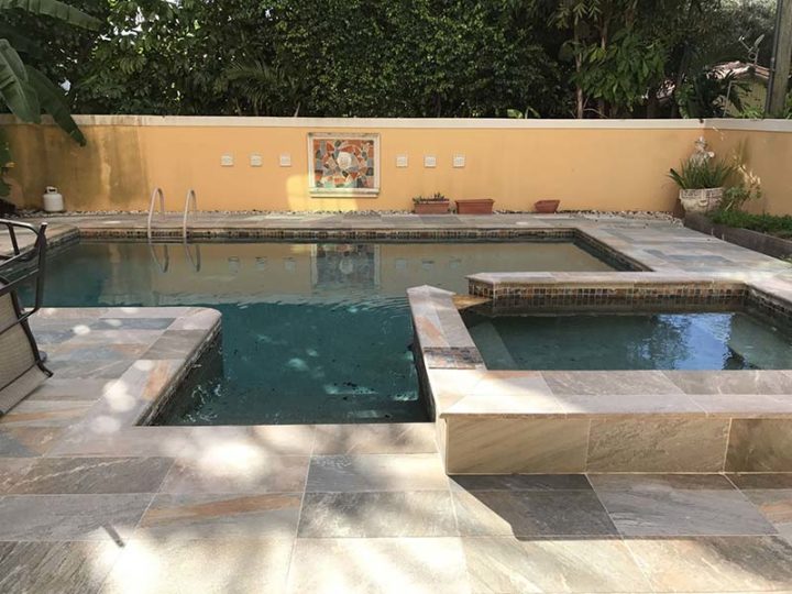
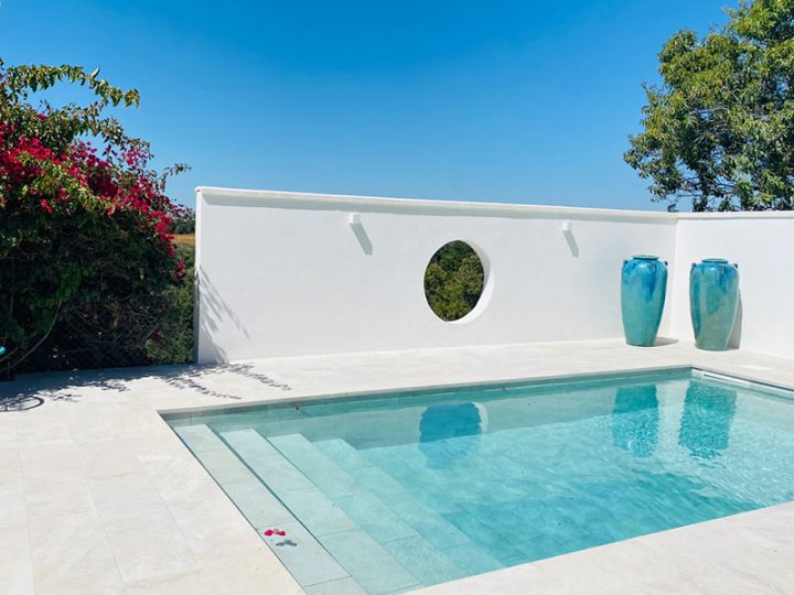
This happened to us when we launched the mystery collection in 2013. The colors looked much better outside than inside. And it was an issue that concerned us. With time – thanks to its hyper-realist stone design; its 4 graphically highly rich colors; the security it provides (it prevents slipping); its beautiful pool steps and edges; and the fact that it is so easy to clean (it never looks filthy) – mystery became our highest selling series. I think mystery owes its success to its beauty. But also to the way we avoided the “color-inside-and-outside-the-shop” conflict. This time the solution was thanks to trust: the shop owner knows mystery well, he knows the client will be satisfied, and he transmits that feeling with confidence. The sales of mystery gray (light gray), mystery blue stone (our beautiful bluish dark gray that got a mention in the New York Times), mystery white (white stone), mystery sand (beige-ochre) haven’t stopped growing. Indeed, confidence is great. But it isn’t enough, we want more.
And here’s the best part, the part that lead me to write these lines. In 2015 we are paying special attention to color perception indoors and outdoors. Our aim is to help our clients see the same colors in the shop as the ones they will later see on their terrace or in their pool. We like difficult challenges. And the head of our lab, Manolo Domínguez, doesn’t know how to turn one down. That’s why we are developing a technology to achieve tone stability under different types of light.
I can already tell you that we are just a few months away from the launch. The solution is almost ready and, although some last industrial tests are still pending, it looks like it will work correctly. And thanks to the viral dress and what it made us all think, I realize that if we make it, not only will it be a new milestone for industrial ceramics innovation, but it will also mean that we have found a way to make people’s brains operate in the same way when seeing our products. Isn’t it exciting?
Marta Sugrañes